Homework 8
Audrey Commerford
2025-03-19
Simulating and Fitting Data Distributions
I used data from this study on Dryad, which includes measurements of butterfly wing area measured in mm^2.
Open Libraries
library(ggplot2) # for graphics
library(MASS) # for maximum likelihood estimation
##
## Attaching package: 'MASS'## The following object is masked _by_ '.GlobalEnv':
##
## deaths## The following object is masked from 'package:dplyr':
##
## selectRead in Data
z <- na.omit(read.table("ButterflyData.csv",header=TRUE,sep=",")) # create data frame and remove NA values
str(z)
## 'data.frame': 292 obs. of 4 variables:
## $ no : int 2 3 4 5 7 8 9 10 13 14 ...
## $ weight_adult : num 0.395 0.386 0.334 0.295 0.368 ...
## $ wing_area_mm2: num 769 753 730 682 790 ...
## $ length_mm : num 46.8 46.1 45 42.9 47.5 ...
## - attr(*, "na.action")= 'omit' Named int [1:308] 1 6 11 12 19 20 22 26 29 34 ...
## ..- attr(*, "names")= chr [1:308] "1" "6" "11" "12" ...summary(z)## no weight_adult wing_area_mm2 length_mm
## Min. : 2.0 Min. :0.1780 Min. :493.2 Min. :35.81
## 1st Qu.:106.8 1st Qu.:0.3286 1st Qu.:686.5 1st Qu.:43.89
## Median :267.5 Median :0.3814 Median :746.6 Median :46.09
## Mean :266.2 Mean :0.4154 Mean :745.7 Mean :46.16
## 3rd Qu.:411.2 3rd Qu.:0.5079 3rd Qu.:809.5 3rd Qu.:48.90
## Max. :597.0 Max. :0.7115 Max. :964.5 Max. :54.13Plot histogram of data
p1 <- ggplot(data=z, aes(x=wing_area_mm2, y=..density..)) +
  geom_histogram(color="grey60",fill="cornsilk",size=0.2)
## Warning: Using `size` aesthetic for
## lines was deprecated in
## ggplot2 3.4.0.
## ℹ Please use `linewidth`
## instead.
## This warning is displayed
## once every 8 hours.
## Call
## `lifecycle::last_lifecycle_warnings()`
## to see where this warning was
## generated.print(p1)## Warning: The dot-dot notation
## (`..density..`) was
## deprecated in ggplot2 3.4.0.
## ℹ Please use
## `after_stat(density)`
## instead.
## This warning is displayed
## once every 8 hours.
## Call
## `lifecycle::last_lifecycle_warnings()`
## to see where this warning was
## generated.## `stat_bin()` using `bins =
## 30`. Pick better value with
## `binwidth`.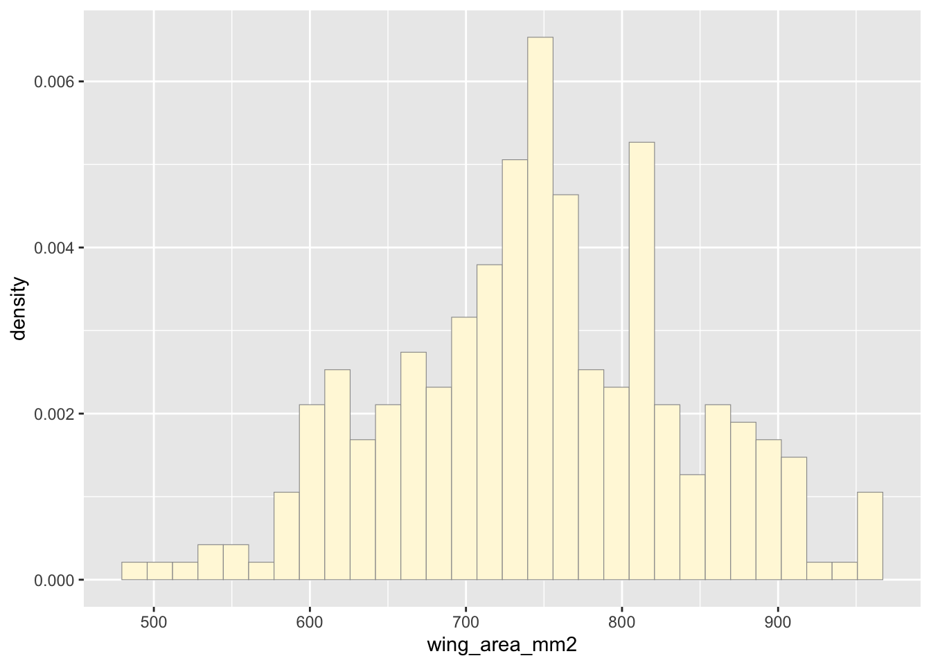
Add empirical density curve
Now modify the code to add in a kernel density plot of the data. This is an empirical curve that is fitted to the data. It does not assume any particular probability distribution, but it smooths out the shape of the histogram:
p1 <-  p1 +  geom_density(linetype="dotted",size=0.75)
print(p1)
## `stat_bin()` using `bins =
## 30`. Pick better value with
## `binwidth`.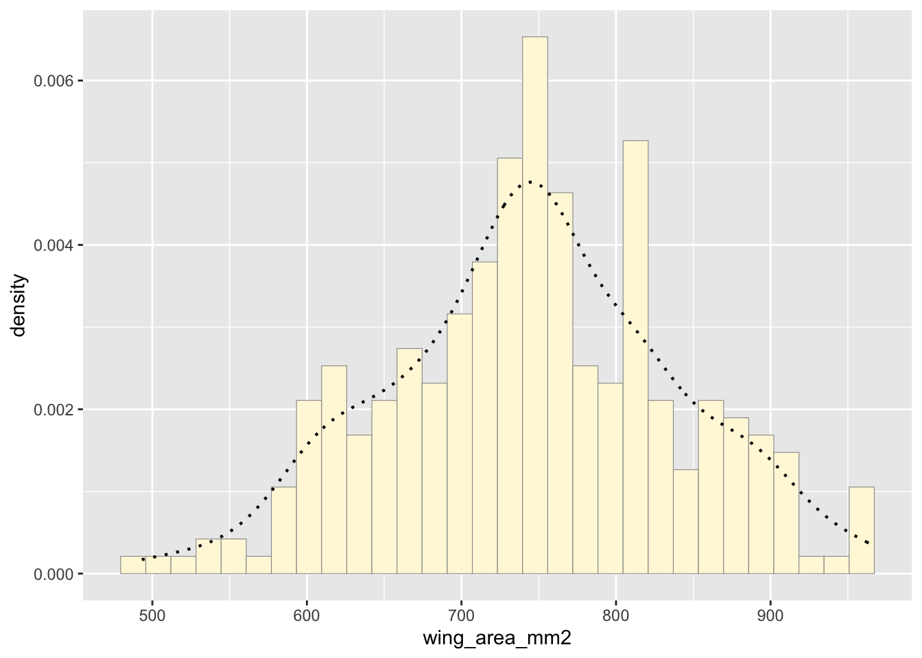
Get maximum likelihood parameters for normal
Next, fit a normal distribution to your data and grab the maximum likelihood estimators of the two parameters of the normal, the mean and the variance:
normPars <- fitdistr(z$wing_area_mm2,"normal")
print(normPars)
## mean sd
## 745.744610 92.894301
## ( 5.436228) ( 3.843994)str(normPars)## List of 5
## $ estimate: Named num [1:2] 745.7 92.9
## ..- attr(*, "names")= chr [1:2] "mean" "sd"
## $ sd : Named num [1:2] 5.44 3.84
## ..- attr(*, "names")= chr [1:2] "mean" "sd"
## $ vcov : num [1:2, 1:2] 29.6 0 0 14.8
## ..- attr(*, "dimnames")=List of 2
## .. ..$ : chr [1:2] "mean" "sd"
## .. ..$ : chr [1:2] "mean" "sd"
## $ n : int 292
## $ loglik : num -1738
## - attr(*, "class")= chr "fitdistr"normPars$estimate["mean"] # note structure of getting a named attribute## mean
## 745.7446Plot normal probability density
Now let’s call the dnorm function inside ggplot’s
stat_function to generate the probability density for the
normal distribution. Read about stat_function in the help
system to see how you can use this to add a smooth function to any
ggplot. Note that we first get the maximum likelihood parameters for a
normal distribution fitted to thse data by calling
fitdistr. Then we pass those parameters
(meanML and sdML to
stat_function):
meanML <- normPars$estimate["mean"]
sdML <- normPars$estimate["sd"]

xval <- seq(0,max(z$wing_area_mm2),len=length(z$wing_area_mm2))

stat <- stat_function(aes(x = xval, y = ..y..), fun = dnorm, colour="red", n = length(z$wing_area_mm2), args = list(mean = meanML, sd = sdML))
 p1 + stat
## `stat_bin()` using `bins =
## 30`. Pick better value with
## `binwidth`.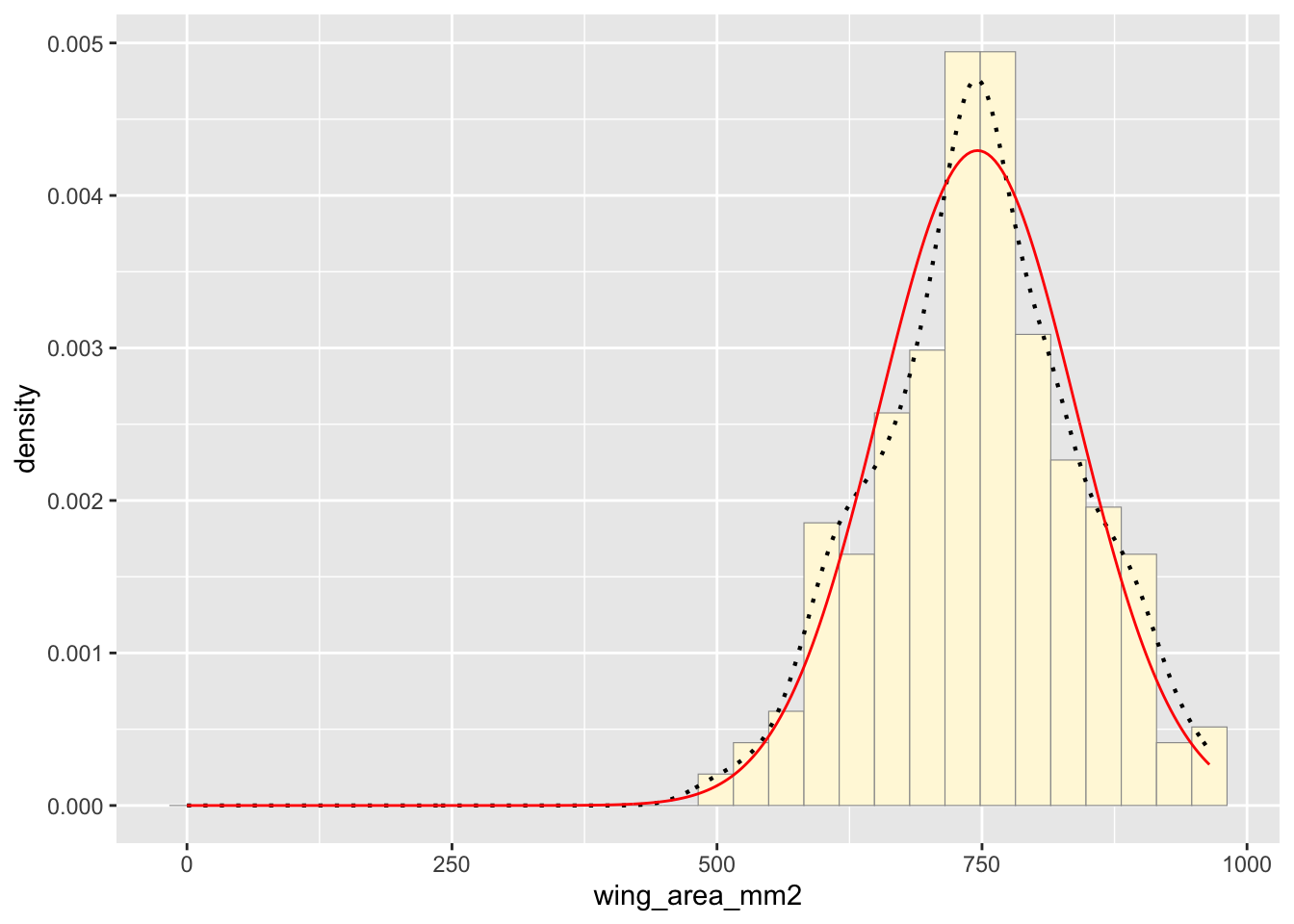
Notice that the best-fitting normal distribution (red curve) for these data actually has a biased mean. That is because the data set has no negative values, so the normal distribution (which is symmetric) is not working well.
Plot exponential probability density
Now let’s use the same template and add in the curve for the exponential:
expoPars <- fitdistr(z$wing_area_mm2,"exponential")
rateML <- expoPars$estimate["rate"]

stat2 <- stat_function(aes(x = xval, y = ..y..), fun = dexp, colour="blue", n = length(z$wing_area_mm2), args = list(rate=rateML))
 p1 + stat + stat2
## `stat_bin()` using `bins =
## 30`. Pick better value with
## `binwidth`.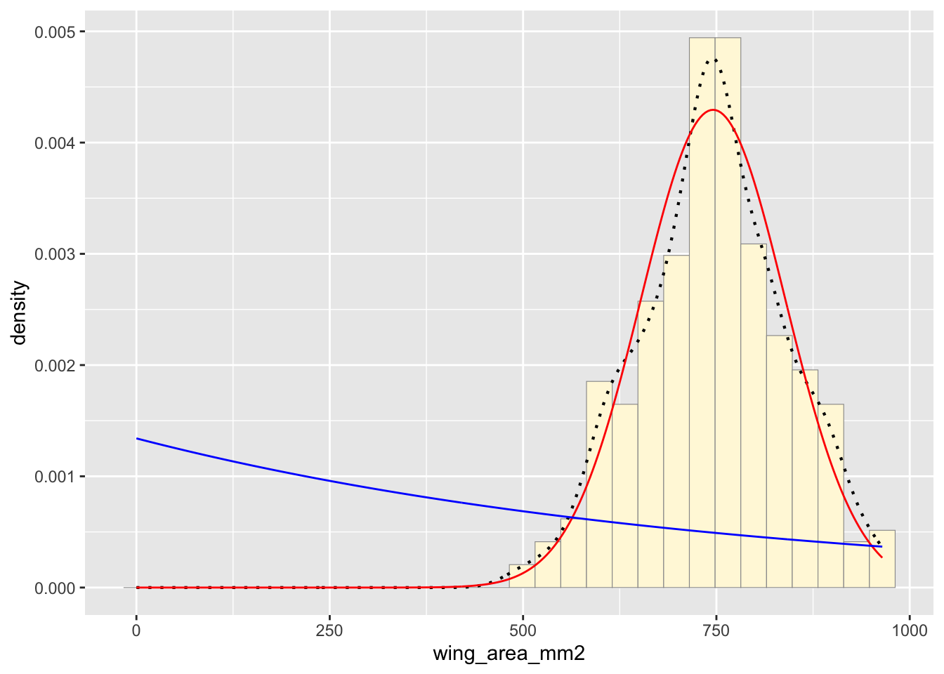
Plot uniform probability density
For the uniform, we don’t need to use fitdistr because the maximum likelihood estimators of the two parameters are just the minimum and the maximum of the data:
stat3 <- stat_function(aes(x = xval, y = ..y..), fun = dunif, colour="darkgreen", n = length(z$wing_area_mm2), args = list(min=min(z$wing_area_mm2), max=max(z$wing_area_mm2)))
 p1 + stat + stat2 + stat3
## `stat_bin()` using `bins =
## 30`. Pick better value with
## `binwidth`.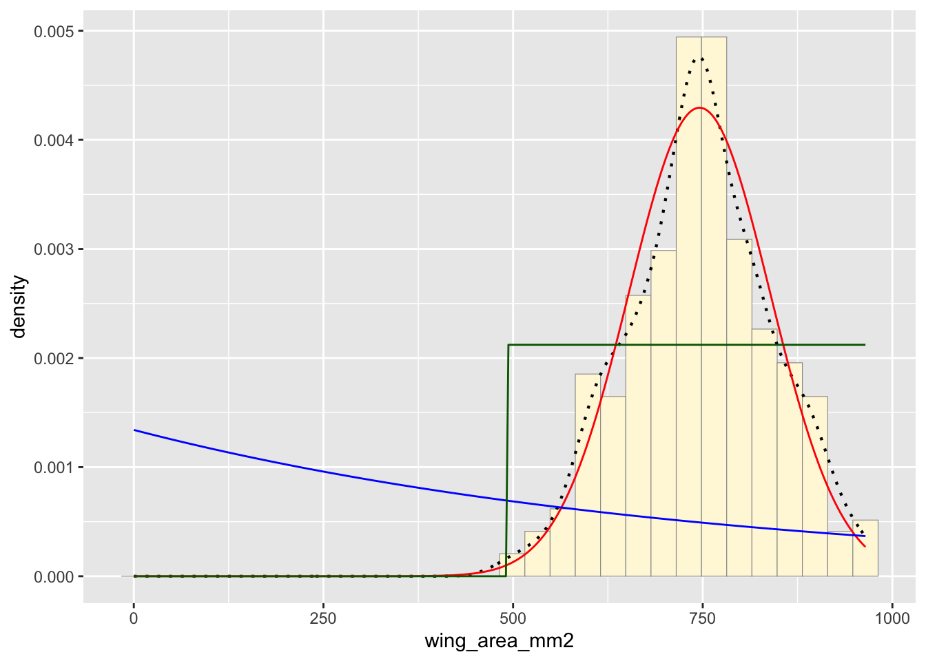
Plot gamma probability density
gammaPars <- fitdistr(z$wing_area_mm2,"gamma")
shapeML <- gammaPars$estimate["shape"]
rateML <- gammaPars$estimate["rate"]

stat4 <- stat_function(aes(x = xval, y = ..y..), fun = dgamma, colour="brown", n = length(z$wing_area_mm2), args = list(shape=shapeML, rate=rateML))
 p1 + stat + stat2 + stat3 + stat4
## `stat_bin()` using `bins =
## 30`. Pick better value with
## `binwidth`.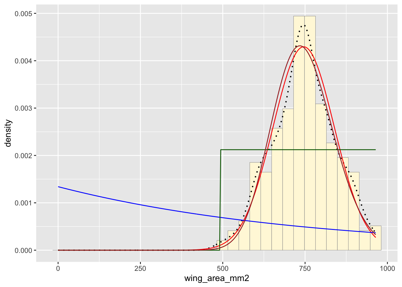
Plot beta probability density
This one has to be shown in its own plot because the raw data must be rescaled so they are between 0 and 1, and then they can be compared to the beta.
pSpecial <- ggplot(data=z, aes(x=wing_area_mm2/(max(wing_area_mm2 + 0.1)), y=..density..)) +
  geom_histogram(color="grey60",fill="cornsilk",size=0.2) +
  xlim(c(0,1)) +
  geom_density(size=0.75,linetype="dotted")

betaPars <- fitdistr(x=z$wing_area_mm2/max(z$wing_area_mm2 + 0.1),start=list(shape1=1,shape2=2),"beta")
## Warning in densfun(x, parm[1], parm[2], ...): NaNs produced
## Warning in densfun(x, parm[1], parm[2], ...): NaNs produced
## Warning in densfun(x, parm[1], parm[2], ...): NaNs produced
## Warning in densfun(x, parm[1], parm[2], ...): NaNs produced
## Warning in densfun(x, parm[1], parm[2], ...): NaNs produced
## Warning in densfun(x, parm[1], parm[2], ...): NaNs produced
## Warning in densfun(x, parm[1], parm[2], ...): NaNs produced
## Warning in densfun(x, parm[1], parm[2], ...): NaNs produced
## Warning in densfun(x, parm[1], parm[2], ...): NaNs producedshape1ML <- betaPars$estimate["shape1"]
shape2ML <- betaPars$estimate["shape2"]
statSpecial <- stat_function(aes(x = xval, y = ..y..), fun = dbeta, colour="orchid", n = length(z$wing_area_mm2), args = list(shape1=shape1ML,shape2=shape2ML))
pSpecial + statSpecial## `stat_bin()` using `bins =
## 30`. Pick better value with
## `binwidth`.## Warning: Removed 2 rows containing
## missing values or values
## outside the scale range
## (`geom_bar()`).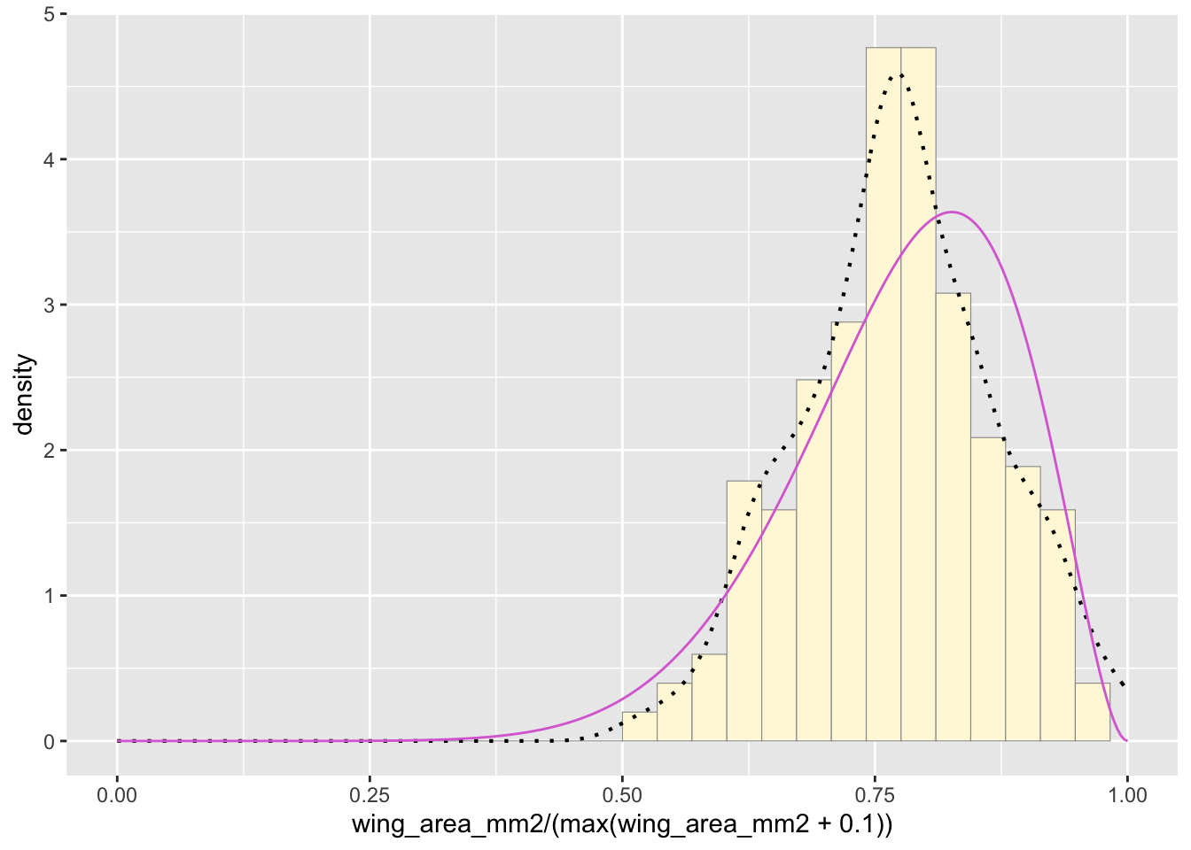
Find Best-Fitting Distribution
For this dataset, both the normal and gamma distributions appear to be a close fit.
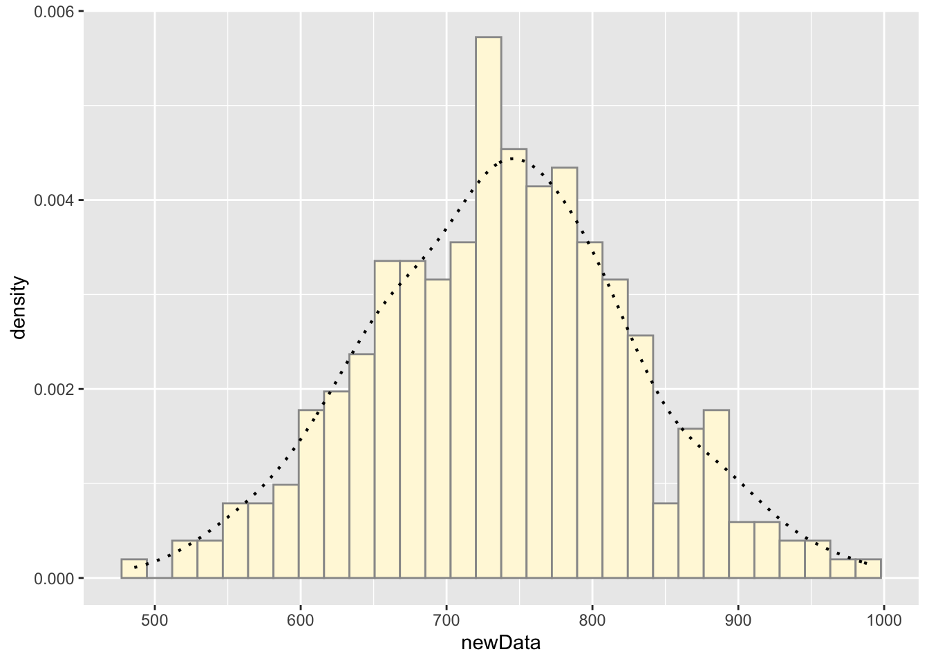
Simulate a New Data Set
This model simulates new data using a normal distribution. This does appear to simulate realistic data that matches the original measurements. Given that the original dataset is a measurement of wing area of butterflies, it makes sense that the measurements would approximately follow a normal distribution.
x <- 1:292
newData <- rnorm(292, mean = meanML, sd = sdML)
df <- cbind(x, newData)

ggplot(data = df, aes(x = newData, y = ..density..)) +
  geom_histogram(color = "grey60", fill = "cornsilk") +
  geom_density(linetype="dotted",size=0.75)
## `stat_bin()` using `bins =
## 30`. Pick better value with
## `binwidth`.